HTML+CSS+JS 翻页时钟教程
 0
0 0
0 0
0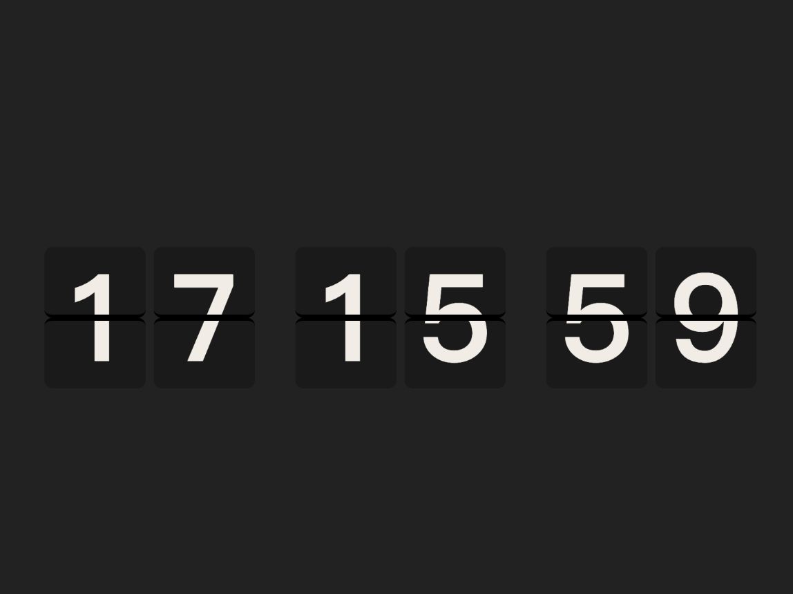
本文展示了一款基于 HTML、CSS 和 JavaScript 的网页翻页时钟。时钟通过平滑翻页动画实时显示时、分、秒,每个数字块只在值变化时触发翻页,保证动画流畅且高效。适合前端学习、网页项目演示或动态时钟效果实现。
1
翻页原理

- 如图所示我们能看见这个就是两个卡片 每个卡片的内容都展示一半来进行拼接 然后我们把底部的卡片反转180度并且隐藏背面就形成了翻页的效果
2
翻页Demo代码
大家看视频可以知道这就是一个遮挡和旋转的效果
<!DOCTYPE html>
<html>
<head>
<meta charset="utf-8" />
<title></title>
<style type="text/css">
body {
background-color: azure;
}
.time-page {
position: relative;
height: 100px;
width: 100px;
}
.card {
text-align: center;
font-size: 60px;
font-weight: 500;
position: absolute;
width: 100%;
height: 50%;
overflow: hidden;
left: 0;
top: 0;
backface-visibility: hidden;
}
.card1 {
background-color: hotpink;
line-height: 100px;
}
.card2 {
top: 50%;
background-color: red;
line-height: 0;
transform: rotateX(180deg);
transform-origin: center top;
transition: .8s;
}
.time-page:hover .card2 {
transform: rotateX(0deg);
}
</style>
</head>
<body>
<div class="time-page">
<div class="card card1">3</div>
<div class="card card2">3</div>
</div>
</body>
</html>
3
展示时间

接下来我们正式开始写代码
我们第一步先把时间进行一个初步的展示 代码如下
大概意思就是我们先获取当前时间 然后循环创建了六个元素 再把当前时间每位进行分割放进这六个元素中
效果如图
<!DOCTYPE html>
<html>
<head>
<meta charset="utf-8">
<title></title>
<style>
.clock-wrap {
display: flex;
justify-content: center;
align-items: center;
height: 100vh;
gap: 8px;
background: #222;
font-weight: 700;
}
.clock-digit {
width: 100px;
height: 140px;
background: #1a1a1a;
border-radius: 8px;
display: flex;
justify-content: center;
align-items: center;
font-size: 120px;
color: #f0ede6;
}
.clock-digit:nth-child(3),
.clock-digit:nth-child(5) {
margin-left: 32px;
}
</style>
</head>
<body>
<div class="clock-wrap" id="clock-wrap"></div>
</body>
<script type="text/javascript">
const colElms = [];
const timeEl = document.getElementById('clock-wrap');
/**
* 获取时间
*/
function getTimeStr(date = new Date()) {
return [date.getHours(), date.getMinutes(), date.getSeconds()]
.map((item) => item.toString().padStart(2, "0"))
.join("");
}
/**
* 创建元素
*/
function createCol() {
const div = document.createElement("div");
div.classList.add("clock-digit");
timeEl.append(div);
return div;
}
/**
* 循环创建
*/
for (let i = 0; i < 6; i++) {
colElms.push(createCol());
}
/**
* 设置时间
*/
function updateTime() {
const digits = getTimeStr().split("");
colElms.forEach((el, i) => {
el.textContent = digits[i];
});
}
updateTime();
</script>
</html>
4
自动更新时间
我们在上一步进行了时间的展示 现在我们需要把时间的自动更新添加进去 其实就加一个定时即可
完整代码如下 效果看视频
<!DOCTYPE html>
<html>
<head>
<meta charset="utf-8">
<title></title>
<style>
.clock-wrap {
display: flex;
justify-content: center;
align-items: center;
height: 100vh;
gap: 8px;
background: #222;
font-weight: 700;
}
.clock-digit {
width: 100px;
height: 140px;
background: #1a1a1a;
border-radius: 8px;
display: flex;
justify-content: center;
align-items: center;
font-size: 120px;
color: #f0ede6;
}
.clock-digit:nth-child(3),
.clock-digit:nth-child(5) {
margin-left: 32px;
}
</style>
</head>
<body>
<div class="clock-wrap" id="clock-wrap"></div>
</body>
<script type="text/javascript">
const colElms = [];
const timeEl = document.getElementById('clock-wrap');
/**
* 获取时间
*/
function getTimeStr(date = new Date()) {
return [date.getHours(), date.getMinutes(), date.getSeconds()]
.map((item) => item.toString().padStart(2, "0"))
.join("");
}
/**
* 创建元素
*/
function createCol() {
const div = document.createElement("div");
div.classList.add("clock-digit");
timeEl.append(div);
return div;
}
/**
* 循环创建
*/
for (let i = 0; i < 6; i++) {
colElms.push(createCol());
}
/**
* 设置时间
*/
function updateTime() {
const digits = getTimeStr().split("");
colElms.forEach((el, i) => {
el.textContent = digits[i];
});
}
updateTime();
setInterval(updateTime, 1000);
</script>
</html>
5
制作翻页效果


123
完整代码如下大概原理就是再定时器触发的时候循环六个卡片判断哪个卡片的数字改变了如果改变了就触发翻页事件,然后再翻片过程中再写入新的值到新片上 以此往复 效果看视频 能看见class再一直更新
<!DOCTYPE html>
<html>
<head>
<meta charset="utf-8">
<title></title>
<style>
.clock-wrap {
display: flex;
justify-content: center;
align-items: center;
height: 100vh;
gap: 8px;
background: #222;
font-weight: 700;
}
/* 翻页结构容器 */
.clock-digit {
position: relative;
width: 100px;
height: 140px;
border-radius: 8px;
overflow: hidden;
}
/* 每两块一个间隔 */
.clock-digit:nth-child(3),
.clock-digit:nth-child(5) {
margin-left: 32px;
}
/* 上下半片公共样式,各占数字块一半高度 */
.digit-face,
.digit-face-next {
position: relative;
width: 100px;
height: 70px;
font-size: 120px;
background: #1a1a1a;
border-radius: 8px;
color: #f0ede6;
overflow: hidden;
box-sizing: border-box;
}
.digit-flap .digit-face::before,
.digit-flap .digit-face-next::before,
.clock-digit > .digit-face::before,
.clock-digit > .digit-face-next::before {
position: absolute;
content: attr(data-t);
line-height: 140px;
text-align: center;
height: 140px;
left: 0;
right: 0;
}
/* 翻片正面 & 静态下半片 */
.digit-flap .digit-face::before,
.clock-digit > .digit-face-next::before {
top: 0;
}
/* 翻片背面 & 静态上半片 */
.digit-flap .digit-face-next::before,
.clock-digit > .digit-face::before {
bottom: 0;
}
/* 分割线样式 */
.digit-flap .digit-face,
.clock-digit > .digit-face-next {
border-bottom: 3px solid #000;
}
/* 分割线样式 */
.digit-flap .digit-face-next,
.clock-digit > .digit-face {
border-top: 3px solid #000;
}
/* 翻片背面 */
.digit-flap .digit-face-next {
transform: rotateX(-180deg);
backface-visibility: hidden;
}
/* 翻片正面 */
.digit-flap .digit-face {
position: absolute;
top: 0;
backface-visibility: hidden;
}
/* 翻页片容 */
.digit-flap {
position: absolute;
width: 100px;
height: 140px;
z-index: 1;
transform-style: preserve-3d;
/* 默认无过渡,用于动画结束后静默复位 */
transition: transform 0s;
transform: rotateX(0);
}
/* 翻页效果 */
.digit-flap.is-flipping {
transition: all 0.5s ease-in-out;
transform: rotateX(-180deg);
}
</style>
</head>
<body>
<div class="clock-wrap" id="clock-wrap"></div>
</body>
<script type="text/javascript">
// 存储每个数字块的操作对象
const colElms = [];
const timeEl = document.getElementById('clock-wrap');
/**
* 获取当前时间字符串,格式为 "HHmmss"(6位数字)
*/
function getTimeStr(date = new Date()) {
return [date.getHours(), date.getMinutes(), date.getSeconds()]
.map((item) => item.toString().padStart(2, "0"))
.join("");
}
/**
* 创建单个数字块,内部结构:
* 静态上半片(digit-face-next):显示新值的下半部分
* 静态下半片(digit-face):显示当前值的上半部分
* 翻页片(digit-flap):
* 正面(digit-face):当前值上半,翻转前可见
* 背面(digit-face-next):新值上半,翻转后可见
* 返回操作该数字块的方法集合
*/
function createCol() {
const createEl = (cls) => {
const div = document.createElement("div");
div.classList.add(cls);
return div;
};
const col = createEl("clock-digit");
// 翻页片容器
const flap = createEl("digit-flap");
// 翻片背面(新值)
const flipNext = createEl("digit-face-next");
// 翻片正面(当前值)
const flipCurr = createEl("digit-face");
// 静态上半片(新值)
const next = createEl("digit-face-next");
// 静态下半片(当前值)
const curr = createEl("digit-face");
flap.append(flipNext, flipCurr);
col.append(flap, next, curr);
timeEl.append(col);
return {
// 切换翻转动画(
toggleActive: () => flap.classList.toggle("is-flipping"),
// 读取静态下半片当前显示的值
getCurr: () => curr.dataset.t,
// 同步写入翻片正面 + 静态下半片(当前值)
setCurr: (t) => [flipCurr, curr].forEach((el) => (el.dataset.t = t)),
// 同步写入翻片背面 + 静态上半片(新值)
setNext: (t) => [flipNext, next].forEach((el) => (el.dataset.t = t)),
};
}
// 循环创建 6 个数字块(时、分、秒各两位)
for (let i = 0; i < 6; i++) {
colElms.push(createCol());
}
// 初始化:将当前时间写入所有数字块
const timeStr = getTimeStr();
colElms.forEach(({ setCurr }, i) => {
setCurr(timeStr[i]);
});
/**
* 执行翻页动画
* @param {object} col - createCol 返回的操作对象
* @param {string} next - 新的数字字符
*/
function flipCard(col, next) {
// 预写新值到翻片背面
col.setNext(next);
// 触发翻转动画
col.toggleActive();
setTimeout(() => {
// 移除 is-flipping,翻片无动画归位
col.toggleActive();
// 静态下半片切换为新值
col.setCurr(next);
}, 500);
}
/**
* 更新时间,仅对值发生变化的数字块触发翻页
*/
function updateTime() {
const currStr = getTimeStr();
colElms.forEach((col, i) => {
// 只触发变化数字的翻页效果
if (col.getCurr() !== currStr[i]) {
flipCard(col, currStr[i]);
}
});
}
// 每秒更新一次
setInterval(updateTime, 1000);
</script>
</html>
6
完整效果
效果看视频 完整代码看上一步直接复制
 0
0 0
0 0
0 qq空间
qq空间  微博
微博  复制链接
复制链接  分享
分享  本文未经作者允许授权,禁止转载
 更多相关项目
猜你喜欢
评论/提问(已发布 0 条)
 评论
评论  收藏
收藏  分享
分享  下载
下载  举报
举报  回顶部
回顶部