<script setup lang="ts">
import type {Ref} from "vue";
const model: Ref<boolean> = defineModel( {type: Boolean, default: true});
</script>
<template>
<button class="glass-switch" @click="model =!model" :class="`${model?'active':'notActive'}`">
<span class="glass-switch-thumb"/>
</button>
</template>
<style scoped lang="scss">
// 开关的边框
.glass-switch {
// 滑块宽度
--thumb-size: 20px;
position: relative;
width: 48px;
height: 27px;
background: rgba(255, 255, 255, 0.08);
border-radius: 13px;
border: 1.5px solid rgba(255, 255, 255, 0.12);
cursor: pointer;
transition: all 0.3s cubic-bezier(0.4, 0, 0.2, 1);
box-shadow: inset 0 2px 4px rgba(0, 0, 0, 0.2);
}
// 选中样式
.glass-switch.active {
background: rgba(255, 255, 255, 0.16);
backdrop-filter: blur(30px) saturate(150%);
-webkit-backdrop-filter: blur(30px) saturate(150%);
border-color: rgba(255, 255, 255, 0.25);
box-shadow: 0 3px 5px rgba(0, 0, 0, 0.15),
inset 0 2px 3px rgba(255, 255, 255, 0.45);
}
// 滑块公共样式
.glass-switch-thumb {
width: var(--thumb-size);
height: var(--thumb-size);
border-radius: 50%;
transition: left 0.3s ease;
}
// 选中时候的滑块样式
.glass-switch.active .glass-switch-thumb {
position: absolute;
top: 2px;
left: calc(100% - var(--thumb-size) - 2px);
background: linear-gradient(135deg, rgba(255, 255, 255, 0.7), rgba(255, 255, 255, 0.55));
box-shadow: 0 2px 8px rgba(0, 0, 0, 0.25);
}
// 未选中的滑块样式
.glass-switch.notActive .glass-switch-thumb {
box-shadow: 0 2px 6px rgba(0, 0, 0, 0.3);
background: linear-gradient(135deg, rgba(255, 255, 255, 0.4), rgba(255, 255, 255, 0.3));
position: absolute;
top: 2px;
left: 2px;
}
</style>
 0
0 0
0 0
0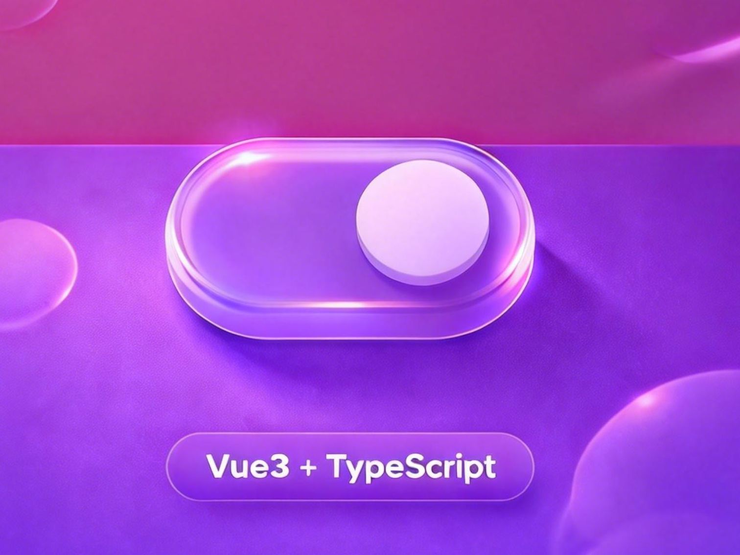


 0
0 0
0 0
0 qq空间
qq空间  微博
微博  复制链接
复制链接  分享
分享  本文未经作者允许授权,禁止转载
 评论
评论  收藏
收藏  分享
分享  下载
下载  举报
举报  回顶部
回顶部