用vue+ts制作玻璃风格的滑块单选器
 0
0 0
0 0
0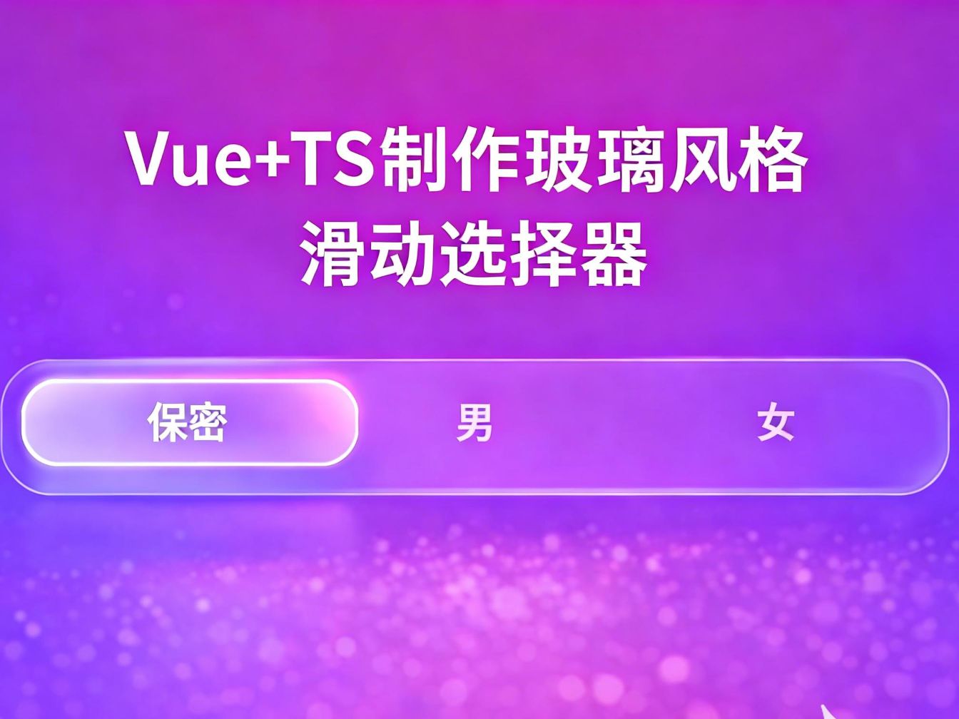
在现代 UI 设计中,玻璃拟态(Glassmorphism) 凭借通透、柔和且富有层次感的视觉效果,逐渐成为高端产品界面的常见选择。相比传统的单选框或 Tab,玻璃风格的滑块单选器不仅在交互上更加直观,也能显著提升整体界面的质感。
本文将基于 Vue 3 + TypeScript ,实现一个可复用的玻璃风格滑块单选器组件。组件支持动态选项数量,通过 CSS 变量与 transform 位移实现平滑的滑块动画,并结合 backdrop-filter、半透明背景和内阴影,打造真实的玻璃质感效果。
1
ts类型

如图所示创建一个文件叫optionType.ts
内容如下
/**
* 选择的类型值
*/
export interface OptionType {
// 展示的内容
label: string | number,
// 选择的值
value: any
}
2
vue内容


12
创建一个文件叫GlassSegmented.vue
内容如下
<script setup lang="ts">
import type {OptionType} from "@/components/glass/select/optionType.ts";
import {type Ref, ref} from "vue";
let model = defineModel();
defineProps<{
options: OptionType[]
}>()
// 选择的下标索引
const activeIndex: Ref<number> = ref(0)
/**
* 选择滑块样式
*/
const onSelect = (item: OptionType, index: number) => {
model.value = item.value
activeIndex.value = index
}
</script>
<template>
<div
class="glass-segmented-box glass-container"
:style="{
'--count': options.length
}"
>
<!-- 滑块 -->
<div class="glass-segmented-slider"
:style="{
transform: `translateX(${activeIndex * 100}%)`
}"
/>
<!-- 选项 -->
<div
v-for="(item, index) in options"
:key="index"
:class="`glass-segmented-item ${item.value === model?'glass-segmented-active':'glass-segmented-notActive'}`"
@click="onSelect(item,index)"
>
{{ item.label }}
</div>
</div>
</template>
<style lang="scss" scoped>
// 最外层边框
.glass-segmented-box {
position: relative;
display: flex;
border-radius: 15px;
height: 45px;
padding: 5px;
}
// 滑块
.glass-segmented-slider {
background: rgba(255, 255, 255, 0.25);
backdrop-filter: blur(40px) saturate(180%);
box-shadow: rgba(255, 255, 255, 0.18) 0 8px 32px, rgba(255, 255, 255, 0.5) 0 1px 0 inset;
border: 1px solid rgba(255, 255, 255, 0.4);
position: absolute;
width: calc(100% / var(--count) - 10px / var(--count));
height: calc(100% - 10px);
border-radius: 15px;
transition: transform 0.25s cubic-bezier(.4, 0, .2, 1);
}
// 选择的每一项
.glass-segmented-item {
display: flex;
align-items: center;
justify-content: center;
flex: 1;
height: 100%;
font-size: 14px;
font-weight: 600;
cursor: pointer;
transition: all 0.25s cubic-bezier(.4, 0, .2, 1);
}
// 为选择的选项样式
.glass-segmented-notActive {
color: rgba(255, 255, 255, .6);
}
// 鼠标悬浮样式
.glass-segmented-notActive:hover {
color: rgba(255, 255, 255, .8);
}
// 选中样式
.glass-segmented-active {
color: #fff;
font-weight: 600;
mix-blend-mode: color;
}
</style>
3
如何使用?

使用代码如下 效果如图
<script setup lang="ts">
import GlassSegmented from "@/components/glass/GlassSegmented.vue";
import {reactive, ref} from "vue";
const options = reactive([
{ label: '保密', value: 'u' },
{ label: '男', value: 'm' },
{ label: '女', value: 'f' }
])
const model = ref()
</script>
<template>
<GlassSegmented
v-model="model"
:options="options"
/>
</template>
<style scoped>
</style>
4
演示
演示效果请看
 0
0 0
0 0
0 qq空间
qq空间  微博
微博  复制链接
复制链接  分享
分享  本文未经作者允许授权,禁止转载
 更多相关项目
猜你喜欢
评论/提问(已发布 0 条)
 评论
评论  收藏
收藏  分享
分享  下载
下载  举报
举报  回顶部
回顶部