Vue3封装自定义Select选择器组件附完整源码:Select和Option分离组件封装
 0
0 0
0 0
0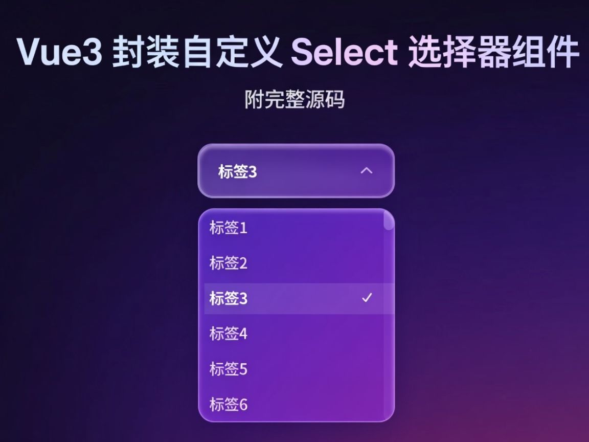
在这篇文章中,你将学会如何用 Vue 3 + TypeScript 封装一个 高颜值自定义 Select 组件。组件采用 Select 与 Option 分离设计,支持 响应式绑定、选中状态更新和回调事件,还能根据视口空间 智能调整下拉方向,保证界面始终美观实用。更酷的是,它还使用了 玻璃风格 UI,结合模糊和透明效果,让你的下拉菜单既好看又现代。附完整源码,手把手教你打造可复用、可拓展的下拉选择器
1
前言

因为我自己做的项目的下拉框样式需要高度的自定义,html的select没有办法高度自定义optino 用市面上的样式组件呢又跟我自己网站的主题风格不符合 所以我就自己写一个自定义的下拉框
2
OptionType 类型

如图所示在select包下面新建一个ts文件optionType.ts 文件内容如下
/**
* 下拉框选择的类型值
*/
export interface OptionType {
// 展示的内容
label: string | number,
// 选择的值
value: any
}
3
select 组件

代码内容如下 效果如图 大概原理呢就是我们通过provide声明一些方法 到时候子组件调用,然后为了解决外部修改value label回显的问题 我们建立一个optionMaps池 然后监听value的值 修改 vaule值我们监听到再从map中获取label
<script setup lang="ts">
import {provide, ref, watch} from "vue";
import type {OptionType} from "@/components/glass/select/optionType.ts";
defineProps<{
placeholder: string
}>()
// 传过来的值
const modelValue = defineModel();
let emits = defineEmits(['change']);
// 显示下拉框
const showOption = ref(false)
// option池
const optionMaps: Map<string, OptionType> = new Map()
/**
* 设置optionMap
* @param option
*/
const setOptionMap = (option: OptionType) => {
optionMaps.set(option.value.toString(), option);
}
// 添加值到option中方法向子组件传递
provide('setOptionMap', setOptionMap);
/**
* 删除optionMap中的某个值
* @param value
*/
const delOptionMap = (value: any) => {
optionMaps.delete(value);
}
// 删除option方法向子组件传递
provide('delOptionMap', delOptionMap);
// 选择的值向子组件传递
provide('selectValue', modelValue);
/**
* 修改options 状态
*/
const updateOptionStatus = () => {
showOption.value = !showOption.value
}
// 展示的内容
const label = ref();
// 监听值是否改变
watch(modelValue, (value) => {
let option = optionMaps.get(value.toString());
label.value = option ? option.label : value
})
/**
* 修改选择的值
* @param option 选择的值
*/
const updateSelectObj = (option: OptionType) => {
// 设置值
modelValue.value = option.value
// 设置label
label.value = option.label || option.value;
// 回调
emits('change', option.value)
}
// 修改选择的值方法向子组件传递
provide('updateSelectObj', updateSelectObj);
</script>
<template>
<div :class="{'glass-select-box':true, 'glass-select-focus':showOption}" tabindex="1"
@click.stop="updateOptionStatus" @blur.stop="showOption = false">
<div class="glass-select-wrapper">
<span :class="`${modelValue?'glass-select-value':'glass-select-placeholder'}`">
{{ label || placeholder }}
</span>
<i class="fa-solid fa-chevron-down glass-select-icon"></i>
</div>
<div :class="`glass-select-content`"
:style="`visibility:${showOption?'visible':'hidden'}`">
<div class="glass-select-options">
<slot>
<div class="glass-select-notContent">暂无数据内容</div>
</slot>
</div>
</div>
</div>
</template>
<style scoped lang="scss">
// 下拉框的最外层边框
.glass-select-box {
width: 200px;
position: relative;
}
// 下拉框的内容展示部分
.glass-select-wrapper {
cursor: pointer;
display: flex;
align-items: center;
justify-content: space-between;
backdrop-filter: blur(40px) saturate(150%);
-webkit-backdrop-filter: blur(40px) saturate(150%);
gap: 10px;
color: white;
font-size: 15px;
transition: all 0.3s cubic-bezier(0.4, 0, 0.2, 1);
border-radius: 15px;
box-shadow: 0 6px 16px rgba(0, 0, 0, 0.15), inset 0 2px 3px rgba(255, 255, 255, 0.35);
background: rgba(255, 255, 255, 0.08);
border: 2px solid rgba(255, 255, 255, 0.15);
padding: 13px 18px;
}
// 下拉框鼠标悬浮样式
.glass-select-wrapper:hover {
border: 2px solid rgba(255, 255, 255, 0.3);
}
// 提示词
.glass-select-value {
cursor: pointer;
flex: 1;
color: white;
background-color: transparent;
outline: none;
border: none;
font-size: 14px;
font-weight: 600;
}
// 输入框的placeholder
.glass-select-placeholder {
color: rgba(255, 255, 255, 0.5);
font-size: 14px;
font-weight: 500;
}
// 图标样式
.glass-select-icon {
font-size: 12px;
color: rgba(255, 255, 255, 0.6);
transition: all .2s;
}
// 下拉框内容部分
.glass-select-content {
overflow: hidden;
position: absolute;
height: 200px;
width: 100%;
border-radius: 15px;
background: rgba(255, 255, 255, 0.1);
backdrop-filter: blur(100px) saturate(180%);
border: 1px solid rgba(255, 255, 255, 0.3);
box-shadow: 0 6px 16px rgba(0, 0, 0, 0.15), inset 0 2px 3px rgba(255, 255, 255, 0.35);
animation: slide-down 0.3s ease-in;
-webkit-animation: slide-down 0.1s ease-in;
}
// select 部分的option边框
.glass-select-options {
height: 100%;
border-radius: 15px;
overflow: auto;
}
// 没有内容时候的提示
.glass-select-notContent {
display: flex;
align-items: center;
justify-content: center;
height: 100%;
outline: white 1px solid;
color: rgba(255, 255, 255, 0.7);
font-size: 14px;
font-weight: 500;
}
// 有焦点时候的输入框样式
.glass-select-focus {
// select 内容部分
.glass-select-wrapper {
background-color: rgba(255, 255, 255, 0.12);
border: 2px solid rgba(255, 255, 255, 0.3);
}
// 获取焦点图标样式
.glass-select-icon {
transform: rotateZ(180deg);
}
}
// 滚动条宽度
.glass-select-options::-webkit-scrollbar {
width: 10px;
}
// 滚动条滑块
.glass-select-options::-webkit-scrollbar-thumb {
background: rgba(255, 255, 255, 0.22);
border-radius: 10px;
}
// 滚动条轨道
.glass-select-options::-webkit-scrollbar-track {
background: rgba(255, 255, 255, 0.06);
border-radius: 10px;
}
</style>
4
option组件


12
option.vue的代码如下 大概意思就是我们通过inject来获取父组件声明的属性和方法然后在页面加载时候把元素添加到options池子中 销毁时候从里面删除 选择时候进行修改父组件的model值 效果和使用方法如图所示
<script setup lang="ts">
import {inject, onUnmounted, provide} from "vue";
import type {OptionType} from "@/components/glass/select/optionType.ts";
let props = defineProps<{
// 展示的label
label: string | number,
// 选择的值
value: any
}>();
// 修改选中的值
const updateSelectObj = inject<(val: OptionType) => void>('updateSelectObj');
// 选择的值
const selectValue = inject<any>('selectValue');
// 往option池中添加值
const setOptionMap = inject<(option: OptionType) => void>('setOptionMap');
// 从option池中删除值
const delOptionMap = inject<(value: any) => void>('delOptionMap');
/**
* 修改选中的option的值
*/
const updateOption = () => {
updateSelectObj?.({label: props.label, value: props.value})
}
provide('updateOption', updateOption);
/**
* 初始化select的值
*/
const initializationSelect = () => {
// 判断是否为 当前选项
if (selectValue.value == props.value) {
updateOption()
}
// 添加值到option池
setOptionMap?.({label:props.label,value:props.value})
}
// 组件销毁的声明周期
onUnmounted(() => {
// 从option 池中删除对象
delOptionMap?.(props.value)
})
initializationSelect()
</script>
<template>
<div class="glass-option-box " @click="updateOption">
<span>{{ label }}</span>
<i v-if="selectValue==value" class="fa-solid fa-check glass-option-icon"></i>
</div>
</template>
<style scoped lang="scss">
// 最外层边框
.glass-option-box {
cursor: pointer;
gap: 5px;
display: flex;
align-items: center;
justify-content: space-between;
font-weight: 500;
font-size: 14px;
color: rgb(255, 255, 255, 0.8);
padding: 6px 10px
}
// 鼠标悬浮样式
.glass-option-box:hover {
background-color: rgba(255, 255, 255, 0.1);
}
// 图标样式
.glass-option-icon {
color: white;
font-size: 10px;
}
</style>
5
定位问题

12
还有就是我们有一个定位的问题,如果我们下拉框下面展示补全应该向上展示 我们可以用滚动事件和选择事件解决这个问题
大概原理就是我们在展示下拉框和滚动的时候都触发 positionCalculation事件, positionCalculation里面是计算option整体的高度 以及距离上下左右的距离 依次进行判断有哪个就向哪个方向展示 如果所有方向都没有空间就还是默认下面
效果看视频
select.vue 完整代码如下
<script setup lang="ts">
import {onMounted, onUnmounted, provide, type Ref, ref, watch} from "vue";
import type {OptionType} from "@/components/glass/select/optionType.ts";
import {
getDistanceToViewportBottom,
getDistanceToViewportLeft,
getDistanceToViewportRight,
getDistanceToViewportTop
} from "@/utils/browserUtil.ts";
defineProps<{
placeholder: string
}>()
// 传过来的值
const modelValue = defineModel();
let emits = defineEmits(['change']);
// 显示下拉框
const showOption = ref(false)
// option池
const optionMaps: Map<string, OptionType> = new Map()
/**
* 设置optionMap
* @param option
*/
const setOptionMap = (option: OptionType) => {
optionMaps.set(option.value.toString(), option);
}
// 添加值到option中方法向子组件传递
provide('setOptionMap', setOptionMap);
/**
* 删除optionMap中的某个值
* @param value
*/
const delOptionMap = (value: any) => {
optionMaps.delete(value);
}
// 删除option方法向子组件传递
provide('delOptionMap', delOptionMap);
// 选择的值向子组件传递
provide('selectValue', modelValue);
/**
* 修改options 状态
*/
const updateOptionStatus = () => {
showOption.value = !showOption.value
positionCalculation()
}
// 展示的内容
const label = ref();
// 监听值是否改变
watch(modelValue, (value) => {
console.log(typeof value)
let option = optionMaps.get(value.toString());
console.log( value,option)
console.log( optionMaps)
label.value = option ? option.label : value
})
/**
* 修改选择的值
* @param option 选择的值
*/
const updateSelectObj = (option: OptionType) => {
// 设置值
modelValue.value = option.value
// 设置label
label.value = option.label || option.value;
// 回调
emits('change', option.value)
}
// 修改选择的值方法向子组件传递
provide('updateSelectObj', updateSelectObj);
// select的ref
const selectionRef = ref<HTMLElement>()
// option的ref
const optionRef = ref<HTMLElement>()
// 偏移的方向
const offsetDirection: Ref<'Top' | 'Left' | 'Bottom' | 'Right'> = ref('Bottom')
// 预留高度
const reservedHeight = 10;
/**
* 根据下拉选项尺寸和视口可用空间,计算下拉方向
*/
const positionCalculation = () => {
const selectionEl = selectionRef.value
const optionEl = optionRef.value
if (!selectionEl || !optionEl) return
// 获取下拉框空间
const spaceBottom = getDistanceToViewportBottom(selectionEl)
const spaceTop = getDistanceToViewportTop(selectionEl)
const spaceLeft = getDistanceToViewportLeft(selectionEl)
const spaceRight = getDistanceToViewportRight(selectionEl)
// 下拉框需求空间
const requiredHeight = optionEl.offsetHeight + reservedHeight
const requiredWidth = optionEl.offsetWidth + reservedHeight
// 按优先级判断,依次判断空间是否够用
if (spaceBottom >= requiredHeight) {
offsetDirection.value = 'Bottom'
} else if (spaceTop >= requiredHeight) {
offsetDirection.value = 'Top'
} else if (spaceLeft >= requiredWidth) {
offsetDirection.value = 'Left'
} else if (spaceRight >= requiredWidth) {
offsetDirection.value = 'Right'
} else {
// 如果都不够用,默认向下展开
offsetDirection.value = 'Bottom'
}
}
onMounted(() => {
// 监听真正的滚动容器,而不是 window
const optionEl = optionRef.value
if (optionEl) {
window.addEventListener('scroll', positionCalculation)
}
})
onUnmounted(() => {
window.removeEventListener('scroll', positionCalculation)
})
</script>
<template>
<div ref="selectionRef" :class="{'glass-select-box':true, 'glass-select-focus':showOption}" tabindex="1"
@click.stop="updateOptionStatus" @blur.stop="showOption = false">
<div class="glass-select-wrapper">
<span :class="`${modelValue?'glass-select-value':'glass-select-placeholder'}`">
{{ label || placeholder }}
</span>
<i class="fa-solid fa-chevron-down glass-select-icon"></i>
</div>
<div ref="optionRef" :class="`glass-select-content ${'glass-options'+offsetDirection}`"
:style="`visibility:${showOption?'visible':'hidden'}`">
<div class="glass-select-options">
<slot>
<div class="glass-select-notContent">暂无数据内容</div>
</slot>
</div>
</div>
</div>
</template>
<style scoped lang="scss">
// 下拉框的最外层边框
.glass-select-box {
width: 200px;
position: relative;
}
// 下拉框的内容展示部分
.glass-select-wrapper {
cursor: pointer;
display: flex;
align-items: center;
justify-content: space-between;
backdrop-filter: blur(40px) saturate(150%);
-webkit-backdrop-filter: blur(40px) saturate(150%);
gap: 10px;
color: white;
font-size: 15px;
transition: all 0.3s cubic-bezier(0.4, 0, 0.2, 1);
border-radius: 15px;
box-shadow: 0 6px 16px rgba(0, 0, 0, 0.15), inset 0 2px 3px rgba(255, 255, 255, 0.35);
background: rgba(255, 255, 255, 0.08);
border: 2px solid rgba(255, 255, 255, 0.15);
padding: 13px 18px;
}
// 下拉框鼠标悬浮样式
.glass-select-wrapper:hover {
border: 2px solid rgba(255, 255, 255, 0.3);
}
// 提示词
.glass-select-value {
cursor: pointer;
flex: 1;
color: white;
background-color: transparent;
outline: none;
border: none;
font-size: 14px;
font-weight: 600;
}
// 输入框的placeholder
.glass-select-placeholder {
color: rgba(255, 255, 255, 0.5);
font-size: 14px;
font-weight: 500;
}
// 图标样式
.glass-select-icon {
font-size: 12px;
color: rgba(255, 255, 255, 0.6);
transition: all .2s;
}
// 下拉框内容部分
.glass-select-content {
overflow: hidden;
position: absolute;
height: 200px;
width: 100%;
border-radius: 15px;
background: rgba(255, 255, 255, 0.1);
backdrop-filter: blur(100px) saturate(180%);
border: 1px solid rgba(255, 255, 255, 0.3);
box-shadow: 0 6px 16px rgba(0, 0, 0, 0.15), inset 0 2px 3px rgba(255, 255, 255, 0.35);
animation: slide-down 0.3s ease-in;
-webkit-animation: slide-down 0.1s ease-in;
}
// 在下面展示的位置
.glass-optionsBottom {
top: calc(100% + 10px);
left: 0;
right: 0;
}
// 在上面展示的位置
.glass-optionsTop {
bottom: calc(-100% + 10px);
transform: translateY(-50%);
left: 0;
right: 0;
}
// 在左展示的位置
.glass-optionsLeft {
top: calc(50%);
transform: translateY(-50%);
right: calc(100% + 10px);
}
// 在右展示的位置
.glass-optionsRight {
top: calc(50%);
transform: translateY(-50%);
left: calc(100% + 10px);
}
// select 部分的option边框
.glass-select-options {
height: 100%;
border-radius: 15px;
overflow: auto;
}
// 没有内容时候的提示
.glass-select-notContent {
display: flex;
align-items: center;
justify-content: center;
height: 100%;
outline: white 1px solid;
color: rgba(255, 255, 255, 0.7);
font-size: 14px;
font-weight: 500;
}
// 有焦点时候的输入框样式
.glass-select-focus {
// select 内容部分
.glass-select-wrapper {
background-color: rgba(255, 255, 255, 0.12);
border: 2px solid rgba(255, 255, 255, 0.3);
}
// 获取焦点图标样式
.glass-select-icon {
transform: rotateZ(180deg);
}
}
// 滚动条宽度
.glass-select-options::-webkit-scrollbar {
width: 10px;
}
// 滚动条滑块
.glass-select-options::-webkit-scrollbar-thumb {
background: rgba(255, 255, 255, 0.22);
border-radius: 10px;
}
// 滚动条轨道
.glass-select-options::-webkit-scrollbar-track {
background: rgba(255, 255, 255, 0.06);
border-radius: 10px;
}
</style>
6
完整效果展示
完整代码在附件里 效果看视频所示
select.zip
5.50KB
 0
0 0
0 0
0 qq空间
qq空间  微博
微博  复制链接
复制链接  分享
分享  本文未经作者允许授权,禁止转载
 更多相关项目
猜你喜欢
评论/提问(已发布 0 条)
 评论
评论  收藏
收藏  分享
分享  下载
下载  举报
举报  回顶部
回顶部