vue3+TS 制作Notification通知组件(玻璃风)
 0
0 0
0 0
0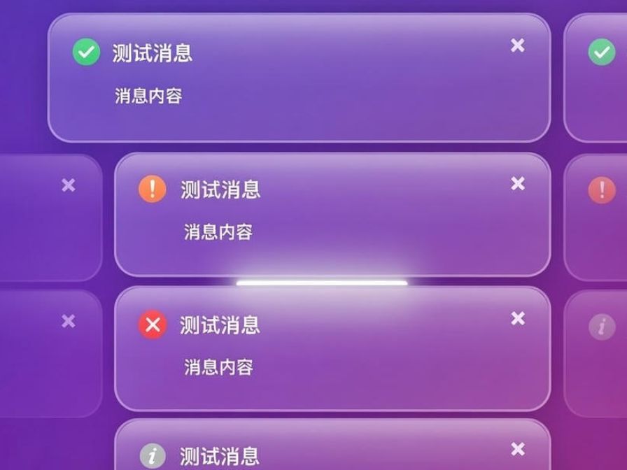
在现代 Web 应用中,通知消息(Notification)是提升用户体验的重要组件。它可以在用户完成操作、出现错误或需要提醒时,及时提供可视化反馈。本文将使用 Vue 3 + TypeScript 从零打造一个 可复用、可定制的 Notification 通知组件。我们将深入讲解如何通过 Composition API 管理组件状态,实现消息的动态添加与自动关闭;如何支持多种类型的通知,如成功、错误、警告和信息;以及如何使用消息队列防止重复覆盖,保证界面整洁。通过本文的学习,你不仅能快速搭建实用的通知系统,还能掌握 Vue 3 + TS 组件开发的最佳实践,为你的项目带来更流畅、专业的用户体
准备工作:
工具:
工具名称
数量
备注
vue3
TypeScript
1
创建组件


123
- 在components 文件夹下面 新建一个notifacation文件夹 如图1所示
- 然后在改文件夹下面新建一个 Notification组件
- 组件内容如下 defineProps里面就是你想要动态展示的值
<script setup lang="ts">
let props = defineProps<{
// 标题
title?: string;
// 消息
message: string;
// 图标地址
img?: string;
// 关闭回调
onClose: () => void;
}>();
/**
* 关闭回调
*/
const handleClose = () => {
props.onClose();
};
</script>
<template>
<transition>
<div class="notification-box">
<img v-if="img" :src="img" width="25px" alt="图标"/>
<div class="notification-content">
<div class="notification-content-title" v-if="props.title">{{ props.title }}</div>
<div class="notification-content-message">{{ props.message }}</div>
</div>
<button class="close-btn " @click="handleClose">×</button>
</div>
</transition>
</template>
<style lang="scss" scoped>
// 通知的最外层边框
.notification-box {
transition: all .3s;
width: 340px;
max-width: 90vw;
min-height: 70px;
padding: 20px;
border-radius: 20px;
box-shadow: 0 8px 32px rgba(0, 0, 0, 0.25);
backdrop-filter: blur(15px);
background: rgba(255, 255, 255, 0.15);
border: 2px solid rgba(255, 255, 255, 0.3);
color: #fff;
pointer-events: auto;
user-select: none;
display: flex;
justify-content: start;
align-items: start;
gap: 10px;
}
// 玻璃质感
.notification-box::before {
content: '';
position: absolute;
top: 0;
left: 0;
width: 100%;
height: 60%;
background: linear-gradient(to bottom,
rgba(255, 255, 255, 0.5) 0%,
rgba(255, 255, 255, 0.2) 30%,
rgba(255, 255, 255, 0.05) 60%,
transparent 100%
);
border-radius: 20px 20px 0 0;
pointer-events: none;
}
// 通知内容部分
.notification-content {
display: flex;
flex-direction: column;
gap: 15px;
}
// 通知标题
.notification-content-title {
font-weight: 500;
font-size: 18px;
}
// 通知的消息提示
.notification-content-message {
font-size: 14px;
font-weight: 500;
}
// 关闭按钮样式
.close-btn {
border: none;
border-radius: 25px;
z-index: 10;
position: absolute;
top: 10px;
right: 12px;
background: none;
color: #fff;
font-size: 24px;
font-weight: bold;
cursor: pointer;
opacity: 0.7;
transition: opacity 0.3s, transform 0.2s;
}
// 关闭按钮鼠标悬浮事件
.close-btn:hover {
opacity: 1;
transform: scale(1.2);
}
</style>
- 我做的是一个玻璃质感的样式 不适合背景颜色纯白的页面 样式大家根据自己的实体情况进行调整,效果就如图2图3所示
2
创建传参类型

- 在notification文件夹下面新建一个 notification.ts 如图1所示
- 然后我们声明 一个对象 这个对象就是 你调用时候传的参数 如下
/**
* 通知调用选项接口
*/
export interface NotificationOptions {
/** 通知标题,可选 */
title?: string;
/** 通知正文内容,必填 */
message: string;
/** 图标路径,可选。如果不传则不显示图标 */
img?: string;
/** 自动关闭延时(毫秒),默认 4500ms。传 0 表示不自动关闭 */
duration?: number;
/** 通知关闭(手动或自动)后执行的回调函数 */
onClose?: () => void;
}
3
编写调用函数内容


123
- notification.ts 的内容如下,然后我们在main.ts中引入即可调用 如图1所示
import {type App, createApp, h, type InjectionKey, ref, TransitionGroup} from 'vue';
import NotificationComponent from '@/components/notification/Notification.vue';
/**
* 通知调用选项接口
*/
export interface NotificationOptions {
/** 通知标题,可选 */
title?: string;
/** 通知正文内容,必填 */
message: string;
/** 图标路径,可选。如果不传则不显示图标 */
img?: string;
/** 自动关闭延时(毫秒),默认 4500ms。传 0 表示不自动关闭 */
duration?: number;
/** 通知关闭(手动或自动)后执行的回调函数 */
onClose?: () => void;
}
/**
* 内部使用的通知项类型(在外部选项基础上添加唯一 id)
*/
type NotificationItem = NotificationOptions & {
/** 唯一标识,用于 Vue key 和关闭定位 */
id: string;
};
// 响应式通知队列,存储当前所有活跃的通知
const notifications = ref<NotificationItem[]>([]);
// 全局通知服务对象
const notification = {
/**
* 通用打开通知方法
* 提供最大灵活性,可自定义任意图标或不传图标(无图标)
* @param options 通知选项
*/
open(options: NotificationOptions) {
// 使用 crypto.randomUUID() 生成更安全的唯一 ID
const id = crypto.randomUUID();
notifications.value.push({...options, id});
// 处理自动关闭逻辑
const duration = options.duration ?? 4500;
if (duration > 0) {
setTimeout(() => this.close(id), duration);
}
},
/**
* 根据 ID 关闭指定通知
* @param id 通知的唯一 ID
*/
close(id: string) {
const index = notifications.value.findIndex(n => n.id === id);
if (index !== -1) {
notifications.value.splice(index, 1); // 移除会触发 TransitionGroup 的离开动画
}
},
/**
* Vue 插件安装方法
* 在 main.ts 中通过 app.use(notification) 注册
* @param app Vue 应用实例
*/
install(app: App) {
// 挂载到全局属性,支持选项式 API 中 this.$notification 调用
app.config.globalProperties.$notification = this;
// 通过 provide/inject 提供实例,支持组合式 API 中 inject(notificationKey)
app.provide(notificationKey as InjectionKey<typeof notification>, this);
// 创建全局通知容器元素
const container = document.createElement('div');
container.className = 'notification-container';
document.body.appendChild(container);
// 创建独立的 Vue 应用,专门负责渲染通知列表
const notificationApp = createApp({
render() {
return h(
TransitionGroup,
{
// 容器标签
tag: 'div',
// 所有消息的最外层容器
class: 'notification-container',
// 进入动画激活类
enterActiveClass: 'notification-enter-active',
// 进入起始状态类
enterFromClass: 'notification-enter-from',
// 离开动画激活类
leaveActiveClass: 'notification-leave-active',
// 离开结束动画
leaveToClass: 'notification-leave-to',
},
// 函数式 children,返回通知组件数组,避免默认 slot 警告
() =>
notifications.value.map(item =>
h(NotificationComponent, {
// 唯一 key
key: item.id,
// 标题
title: item.title,
// 消息内容
message: item.message,
// 图标路径
img: item.img,
// 绑定关闭事件
onClose: () => notification.close(item.id),
})
)
);
},
});
// 挂载独立应用到容器
notificationApp.mount(container);
},
};
// 类型安全的 InjectionKey,用于组合式 API 中的 inject
export const notificationKey: InjectionKey<typeof notification> = Symbol('notification');
// 默认导出插件对象
export default notification;
- 然后我们需要在全局的css里面加入以下样式
/* 通知最外层box */
.notification-container {
margin-top: 20px;
margin-right: 20px;
position: fixed;
top: 0;
right: 0;
width: 400px;
max-height: 100vh;
z-index: 9999;
display: flex;
flex-direction: column;
justify-content: flex-start;
align-items: flex-end;
gap: 16px;
box-sizing: border-box;
}
- 调用方法如图2
- 效果如视频所示 但是他没有动画样式 下一步我们教学动画样式
4
动画效果

12
- 把以下动画效果添加到全局css中 如图1所示
/*设置通知的过度效果*/
.notification-enter-active,
.notification-leave-active {
transition: opacity 0.3s cubic-bezier(0.4, 0, 0.2, 1),
transform 0.3s cubic-bezier(0.4, 0, 0.2, 1);
}
/* 设置通知的动画样式 */
.notification-enter-from,
.notification-leave-to {
opacity: 0;
transform: translateX(120%);
}
- 然后我们再次运行看效果
5
再次封装


123
现在我们的功能以及基本完成了,但是我们调用的时候像成功 失败 这种消息图标都是统一的局内我们会大量的调用,我们可以再次封装,方便使用
在 ts 文件里面添加以下代码测试代码如图所示 效果看视频 要图片的在附件里拿
/**
* 信息类型通知(自动使用默认 info 图标)
* @param options 通知选项(img 会被内部覆盖为默认 info 图标)
*/
info(options: Omit<NotificationOptions, 'img'>) {
this.open({...options, img: '/src/assets/notification/info.png'}); // 建议使用 /assets 开头或 import 方式
},
/**
* 成功类型通知(自动使用默认 success 图标)
* @param options 通知选项
*/
success(options: Omit<NotificationOptions, 'img'>) {
this.open({...options, img: '/src/assets/notification/success.png'});
},
/**
* 警告类型通知(自动使用默认 warning 图标)
* @param options 通知选项
*/
warning(options: Omit<NotificationOptions, 'img'>) {
this.open({...options, img: '/src/assets/notification/warning.png'});
},
/**
* 错误类型通知(自动使用默认 error 图标)
* @param options 通知选项
*/
error(options: Omit<NotificationOptions, 'img'>) {
this.open({...options, img: '/src/assets/notification/error.png'});
},
notification.zip
18.34KB
6
完整代码

12
- 完整内容在附件里,有问题可评论或私信留言
notification.zip
21.87MB
 0
0 0
0 0
0 qq空间
qq空间  微博
微博  复制链接
复制链接  分享
分享  本文未经作者允许授权,禁止转载
 更多相关项目
猜你喜欢
评论/提问(已发布 0 条)
 评论
评论  收藏
收藏  分享
分享  下载
下载  举报
举报  回顶部
回顶部